Updated on March 31, 2024.
Zoom in to the following graph’s red bars;
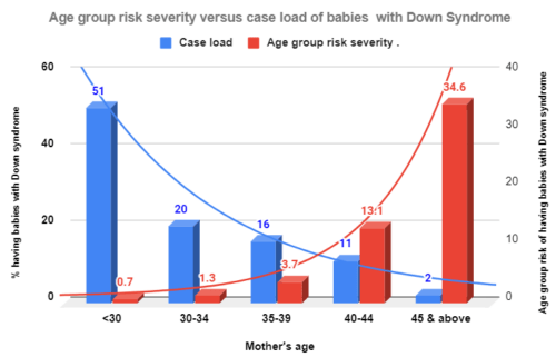
Those red bars represent the probabilities of conceiving a baby with Down syndrome in each group. As we can see in the X-axis, women aged 30 and younger carry the lowest probability risk. Then, the risk level rises with age from 1.3 per cent at 30-34 to 34.6 at 45 and above.
Now, zoom in on the blue bars.
Those represent the share of women with such babies out of all women who delivered babies having Down syndrome by woman’s age group.
Now, the pattern reverses.
The largest share of women with babies diagnosed with Down syndrome belong to the age group – 30 and below – with the lowest risk.
Prevention Paradox in Down syndrome and maternal age
I created the above graph using data from Rose’s 2001 article: “Sick Individuals and Sick Populations.” He burrowed the data from Alberman et al. Rose used these data to explain the “Prevention Paradox”.
Below is how Rose summed up his observation in 1981. He used different data sets at the time.
“A large number of people with a small risk
may give rise to more cases of diseases
than the smaller number at a high risk.
Geoffrey Rose, Sick individuals and sick populations, International Journal of Epidemiology,
Volume 30, Issue 3, June 2001, Pages 427–432, https://doi.org/10.1093/ije/30.3.427
We can find this paradox in many instances.
Prevention Paradox in high blood pressure by age in Ontario
I created the following graph using publicly available data from the Canadian Chronic Disease Surveillance system.
As we can see, although those aged 65 and above carry the highest crude incidence rate for high blood pressure, only 36.4 per cent contribute to the caseload; the majority are diagnosed with high blood pressure 65 and younger.

Prevention Paradox in coronary heart disease and cholesterol levels
The following graph illustrates the paradox in coronary heart disease and cholesterol levels. The curve depicts the risk level; The death rate rises exponentially with higher cholesterol levels. However, the majority of deaths due to the disease occurred not among those with the highest levels because they were few. (I took the graph from Cornel Pater’s 2001 article.)

Prevention Paradox in alcohol-related problems
The following graph illustrates the prevention paradox with alcohol-related hospital admissions; irrespective of gender, contrary to our expectation, only 29 per cent and 34 per cent of men and women respectively, account for alcohol-related hospital admissions. The rest, we can call light-moderate drinkers, account for two-thirds of hospital admissions for alcohol-related problems.
I created the graph using data from the 2006 Kari Poikilonein et al article.

Prevention Paradox in Gambling
In 2016, Natale Canale et al pointed out the existence of a prevention paradox in gambling using data from the British population survey. I created the following graph using the data that appeared in this article.
Gambling is a diagnosable addictive mental health disorder, which results in significant health and social problems. However, the behaviour runs across a continuum. We can find in the following graph that although the individual risk rises with high-risk gamblers, the majority (65 per cent) of gambling problems reportedly occurred among those with low-risk gambling.
This is again clearly a case of prevention paradox.

Why did Rose name it as “Prevention paradox”?
Rose connected and linked the data-based observations to prevention.
Peter Allebeck summed up Rose’s observations as follows;
- The distribution of risk levels for risk factors follows a continuum with high-risk persons staying at the spectrum’s right end.
- Large numbers with low-moderate risk levels contribute to more cases than few with higher risk levels in a population.
The magnitude of the prevention paradox
However, the magnitude of the prevention paradox depends on the distribution of the concerned risk factor in the population; the wider the diffusion of the risk factor, the higher its magnitude on the paradox. It is because the wider the distribution of the risk factor in a population, the larger the share of the population burden that comes from those with low-moderate risk levels. So, it all depends on the shape of the risk factor distribution.
Population strategy
Rose pointed out that the measures targeting the majority who carry a smaller risk yield larger benefits than the measures targeting the minority who hold a higher risk.
And, he named this principle the “Prevention Paradox” also called “population strategy”.
In other words, such population interventions shift the risk curve to the left. Therefore the population strategy prevents more cases and lasts its impact longer than the high-risk strategy which targets only those at the tail of the distribution.