Author: Prasantha De Silva
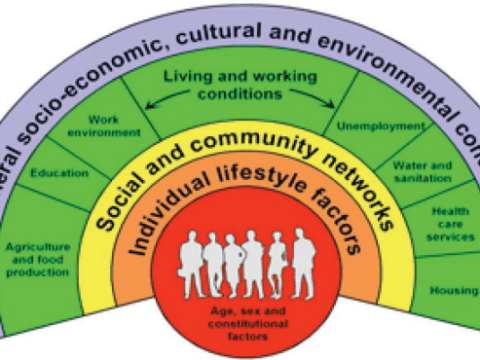
Dahlgren and Whitehead’s “Rainbow Model”
Understanding Dahlgren and Whitehead’s “Rainbow Model” of Health Determinants Health is not just about individual choices or genetics—it is deeply influenced by a broad range of social, economic, and environmental factors. The Dahlgren and Whitehead “Rainbow Model” (1991) provides a comprehensive framework to understand these determinants. It illustrates how multiple layers of influence shape an individual’s health, emphasizing that public health interventions must go beyond personal behavior to address wider social and structural factors. The Structure of the Rainbow Model The “Rainbow Model” is depicted as a series of concentric layers surrounding an individual, with each layer representing different levels…

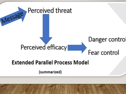
Extended Parallel Process Model (EPPM)
First published on July 21, 2020. Examine this message: “Fast food increases your risk for heart disease due to its high content of trans fat”. (Increasing perceived threat level) Cutting back your fast food intake can reduce your risk for heart disease. (Increasing response efficacy) Preparing your meals at home is one way to reduce eating fast food”. (Increasing self-efficacy) 1. Appraising the threat: Elevating the perceived threat level of the reader The first sentence of the message attempts to elevate the threat level perceived by the target audience/ reader. It uses the fear appeal theory. It says, “Fast food…


Explanatory framing
The explanatory message frames makes causal relationships clear. Such frames help people understand why something happens and then persuades them to take action. Think about this example: “Too often, affordable food options are high in sugar and salt, and healthier options are out of reach due to barriers like limited transport.” The above example exemplifies the cause and effect relationship. Those who understand the relationship are more likely to see the importance of the issue and take steps to address it. Evidence from the UK reveals that explaining how low-cost alcohol leads to alcohol problems and the structural, population-level causes…

How to Use Values in Message Framing
Value-based messaging can attract many people’s attention and avoid victim blaming. Find out how you can do it.

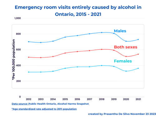
Who visited Ontario Emergency rooms for alcohol-related problems and why?
Almost two-thirds of Ontarians consume alcohol; some seek help from emergency rooms; who are they and why? Daniel T Myran et al. (2019) investigated who and why Ontarians sought emergency rooms’ help for alcohol-related problems. Their study covered emergency room data from 2003 to 2016. Who were they? Two-thirds were men. Of all ER attendees, two-thirds (67.7 per cent) were men (Figure 1). Figure 1: Ontarians’ ED visits by gender, 2003-2016 Almost half of the men were middle-aged. Of them (men), nearly half (42.1 per cent) were between 41 and 64 years. However, almost one-tenth (9.1 per cent) were 18…
Related Articles
Harmful use of alcohol in Simcoe Muskoka
The recent OPHA (Ontario Public Health Association) letter suggests municipalities, Let us dive into the evidence. Who got admitted to the hospital? The website says that in 2021, nearly 1,500 hospital stays (admissions) were recorded among residents of Simcoe Muskoka aged ten and above entirely due to the harmful use of alcohol. (That means these counts did not include the admissions attributable to alcohol). The following data relate to five years from 2017 to 2021. By age Figure 1: Age-specific rates (per 100,000) of hospital stay entirely caused by alcohol, 2017 – 2021. When combining all hospital stays in five…
Commercial Determinants of Health
Traditionally, public health practitioners focus on changing individual behaviour and lifestyles. Anyone can understand it easily by looking at public health messages. For example, think about this message: This was the dominant narrative in the 70s and 80s. Now, it has begun to change. People are asking this question: What is the point of knowing what healthy foods are if we cannot access them and if healthy foods are not available, first of all? Then, invariably, one will ask the next logical question. Why healthy foods are not available? As soon as one asks these questions, we begin to sail…
Related Articles
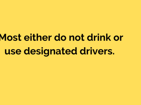
How to frame alcohol policy messages
Personal health narrative “Alcohol is bad for your health” We frequently find the above message in the media as a health education message; this is the dominant narrative. In this narrative, we force readers to think about the illnesses that alcohol drinking may cause. This frame results in two unintended consequences: Responsible drinking narrative “Drink responsibly” The industry invariably turns back and says that, This individualistic, neoliberal thinking dominates even in the public health field when it comes to interventions; the most popular intervention is to educate people about the dangers of alcohol consumption and “responsible drinking”; of course, it…
Maslow did not create Maslow’s pyramid
Three weeks before, I had to unlearn my learning about Maslow’s pyramid; it is not his. He did not build it to explain his theory about human motivation; “Maslow did not build a pyramid to explain his theory”. I read about it for the first time in a Scientific American article. It was titled “Who Created Maslow’s iconic pyramid? and written by Scott Barry Kaufman”. Who built the pyramid? The pyramid was built into Maslow’s theory more than a decade later after Maslow’s initial introduction in 1943. Charles McDermid, a management expert, introduced the pyramid into Maslow’s theory. We can…


Geographic Disparity of Diabetes and high blood pressure in Toronto Neighborhoods
It is obvious. The prevalence of diabetes and high blood pressure varies by neighbourhood in Toronto. The following maps from Ontario Community Health Profile Partnership (OCHPP) website display this geographical disparity. The maps use a colour scale; the darker the area higher the rate. We can find a clear geographical gradient. It ranges from 4.4 per 100 (the lightest colour) to 19 per 100 individuals (the darkest colour) with regard to diabetes (Map 1). But the rates vary from 16 per 100 (the lightest colour) to 31.6 per 100 for high blood pressure (the darkest colour) (Map 2). Map 1:…